|
by Fiona Valentine If you want to make great art, then getting a handle on design & composition is essential! In this blog post I"m sharing three secrets to better design and composition. You might be surprised - it's not what you think. The person looking at your painting is the other half of a conversation. Your job as an artist is to engage their interest so you can communicate, right?.
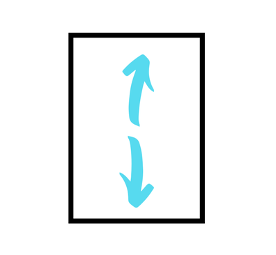
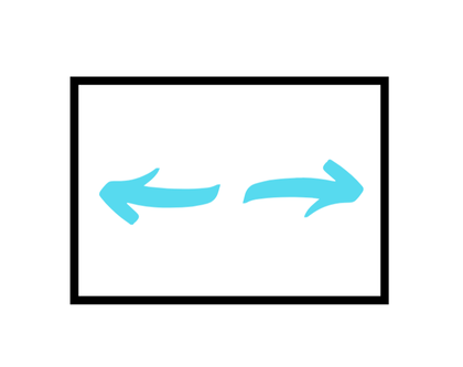
At least, these are the kinds of mental conversations I have with my audience. Others may be making more of a statement to their viewers. Perhaps they want to highlight an issue or have an activist type conversation “Look at this injustice – you have to DO something!!!” There is absolutely a meaningful place in the world for this kind of art, but that’s just not the conversation I’m usually starting with my paint and brushes. Mostly because that’s not the conversation I want to be having at the end of the day when I’m lying on the couch, letting go of a busy day, looking at the paintings on my wall. I’m looking for beauty. For restoration. I want to paint art people choose to hang in their homes. Art that contributes to a feeling of peace. Beauty that is uplifting when life has been a little heavy. That doesn’t make my kind of art the only kind that matters, it just means I know the kind of conversation I’m wanting to have. Good design can help you communicate whatever feeling and vision you want to have rather than distract or bore your friends and collectors. Your art should be attracting people who are like minded, who enjoy what you enjoy especially now that you’ve brought it to their attention! It’s OK if others are bored or alienated. You aren’t trying to please everybody. Thankfully. That would be exhausting, not to mention virtually impossible. If it meant something to you, someone, somewhere will share that and find it meaningful, too. THAT’s who you are “talking” to. Not the imaginary critic in your head who says mean things about your skills, your art, your life, your value... you know. That one. And you are NOT talking to the self appointed critic. You know the one you met at an art show who has a strong opinion that your favourite style of art is "less" somehow? Yep. That's about all I have to say about that one. I don't have much to say to him either. Moving on. So how do you do it? How do you make a painting design that works? Creating a design with wow factor isn’t about finding the perfect subject. Surprise. How much time have you spent trying to find something AMAZING to paint? I know. Me, too. But, really, that’s not the answer. Good design isn’t even about the details - fabulous colour, brush work, highlights and texture. These are really fun to look at in a painting and often get the most comments, BUT they don’t make the painting work all by themselves. They are a bit like the cherry on top of the cake.. Good painting design or composition is actually about some very simple ideas: Design & Composition Secret #1Secret #1 to etter design and composition is that the size and shape of your canvas matters. Or your paper. Or whatever it is you are painting on. Often, newbie painters have an idea and work hard on a design and it’s good. Then they accidentally ruin it by picking up a canvas or piece of paper that is a COMPLETELY DIFFERENT size and shape to their sketch or reference image. Once you realize that your FIRST design decision is the size and shape of your canvas, you can choose this deliberately. Begin to create a strong design based on the size and shape you chose and hold to that design throughout your process. You might have to experiment a bit to get this right. Some things just look better as a square. Or portrait orientation rather than landscape. If you have ever tried to put a photo in a frame that was the wrong size and shape, you know how awful it can look. The last thing you want to do to a great design is squash it, chop bits off or leave it looking lost in a sea of unplanned space. So, crop and fiddle with your sketches or images until you find an arrangement that works. Most of us are familiar with landscape vs portrait orientation on our computers for page layouts and printing. These are actually art terms. The basic proportions of landscape orientation, portrait orientation or a square have different qualities. The portrait format naturally draws your eye up and down, Perfect for drawing attention to the face or figure. A landscape format naturally draws your eye from side to side, exploring the view. A square tends to hold the viewers gaze still. Certain proportions are commonly used in art because they work. Simple as that. The easiest place to find these is to look at the sizes available in your favourite art store for stretched canvas, painting boards or paper. You can then design to the size and proportion you have chosen. Not to mention the size your art store actually has in stock. Designing for a size and shape that isn't available is frustrating. Ain't nobody got time for that. Design and Composition Secret #2Armature is key for good design and composition. If you are thinking, "what the heck is armature", you can relax. It’s just the shape or plan you “hang” the picture on. It’s the way you arrange all the things within the picture. Artists often use triangles, L shapes or S shapes to help them arrange the painting in a way that looks good. Sometimes it’s as simple as a big thing balanced by a little thing on the other side of the painting.
It’s all about knowing WHAT you want the viewer to look at and how you plan to lead them there. Attract attention to particular parts of the painting. Diagonal lines and radiating lines are useful, too. Photographers use similar rules for better photos. Here are some examples:
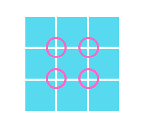
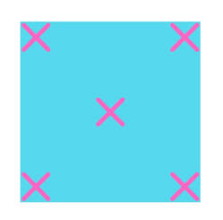
A simple and useful help here is a grid of thirds. Think “tic tac toe” or hashtag. Put the thing you want your viewer to be lead to or focus on at one of the 4 points where the lines intersect. Place the horizon line or eye level on one of the third lines rather than half way up the painting. This simple tool keeps important features away from three places they DON’T belong.
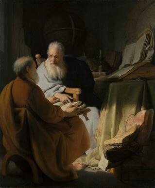
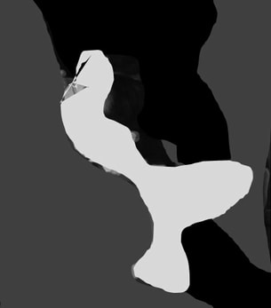
Design and Composition Secret #3 The MOST IMPORTANT aspect of designing paintings with wow is using BIG SHAPES of light or dark. 3 – 5 of these arranged well create impact. Here in Melbourne at the National Gallery of Victoria, we have a fabulous Rembrandt painting called “Two Old Men Disputing” . It’s a wonderful example of big value shapes with all of the detail in the painting managed carefully so that we have a light area, a dark area and a medium value area. No two value areas are the same size or shape. It’s not that there are only 3 objects, but that all the objects in the painting have been kept to similar values within each big shape. The scene has loads of detail – a globe, books, cloth, furniture, two figures, robes, a candle, a quill, even an ink well and a bare foot! Despite all the props, the painting reads very simply as 3 big value shapes. A huge medium value, a dark value and a central light value. Squinting helps – half close your eyes and look. Now do you see it? The pattern of big value shapes looks looks a bit like this: THIS is the way to create a painting that has WOW factor. BIG VALUE SHAPES. To learn more about value, check out my blog post explaining Colour Terms.
Try wandering around the house or outdoors with your phone or camera and capturing images based on simple shapes. Look for light, medium and dark shapes in a pleasing arrangement. Even super ordinary objects or scenes can become the stuff of great design. Look at paintings you like and see if they fit into the 3-5 Big Value Shapes idea. Not all good paintings do, but it is certainly a simple strategy to improve your design. Have fun! Explore! Take a trip to a gallery and see how many Big Shape designs you can spy. Want more hints & tips? You can join my free facebook group by clicking the button below. Once you've joined the group, you can grab your "thanks for joining us" freebie on Making Creative Space. Look for it under "files". Happy designing!
3 Comments
15/5/2019 04:34:52 pm
Nice post, well written. I liked the Rembrant painting as an example of large value blocks.
Reply
Jeanette
6/6/2019 05:55:58 pm
Amazingly interesting. A new learning curve. Numbers 3-5 I understood a bit as I arrange objects in order of size and number. Thank you .
Reply
18/8/2022 07:52:38 am
Thanks Fiona, I will read more of your blog.
Reply
Leave a Reply. |
Hi, I'm Fiona. I'm an artist and art coach. I help aspiring artists learn to paint for fun AND for profit even if they've never sold any of their work before.
You have more than enough creativity and talent, what you need are skills - both for making art and the art of selling art. I can help! Archives
January 2022
Categories
All
|

 RSS Feed